
Fizziness, Elevated: Bottling the Magic of Alchemy.
Extending the luxury heritage of The Alchemist’s Oven into a sparkling soda line where wellness meets indulgence, and simple ingredients transform into extraordinary elixirs.
The Alchemist's Oven
(2025)
The Alchemist’s Oven has always believed in transforming simple ingredients into extraordinary experiences. With the launch of Alchemy Brew, the brand sought to bring that same passion for innovation to a new realm: artisanal beverages. Inspired by their roots in crafting luxury baked goods, this new line of sparkling sodas offers unique blends that are designed to refresh, rejuvenate, and capture the essence of natural ingredients. Our task was to create a packaging system that felt as premium and 'crafted' as the pastries, while standing out in the crowded, neon-lit soda aisle.
Client
The Alchemist's Oven
Services
Packaging Design, Illustration, Brand Extension Strategy,
Campaign Art Direction
The Challenge
Breaking the Soda Aisle Stereotype.
The commercial beverage market is polarized. On one side, you have 'Big Soda'—loud, neon, and synonymous with sugar. On the other, you have clinical sparkling waters that feel devoid of personality.
The Alchemist’s Oven faced a unique friction point: How do you take a brand known for the warmth of the oven and translate it into the cool refreshment of a drink? We needed to design a can that didn't look like a cheap sugar rush. It had to signal "Wellness" without looking medicinal, and "Flavor" without looking artificial. The goal was to create a "New Kind of Fizz" —one that a customer would be proud to hold at a dinner party.
The Solution
"Old World Botany Meets New World Pop."
To solve this, we treated the packaging not as a billboard, but as a botanical canvas.
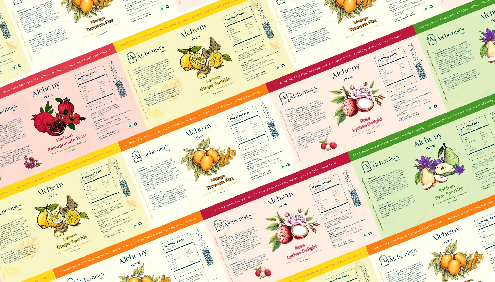
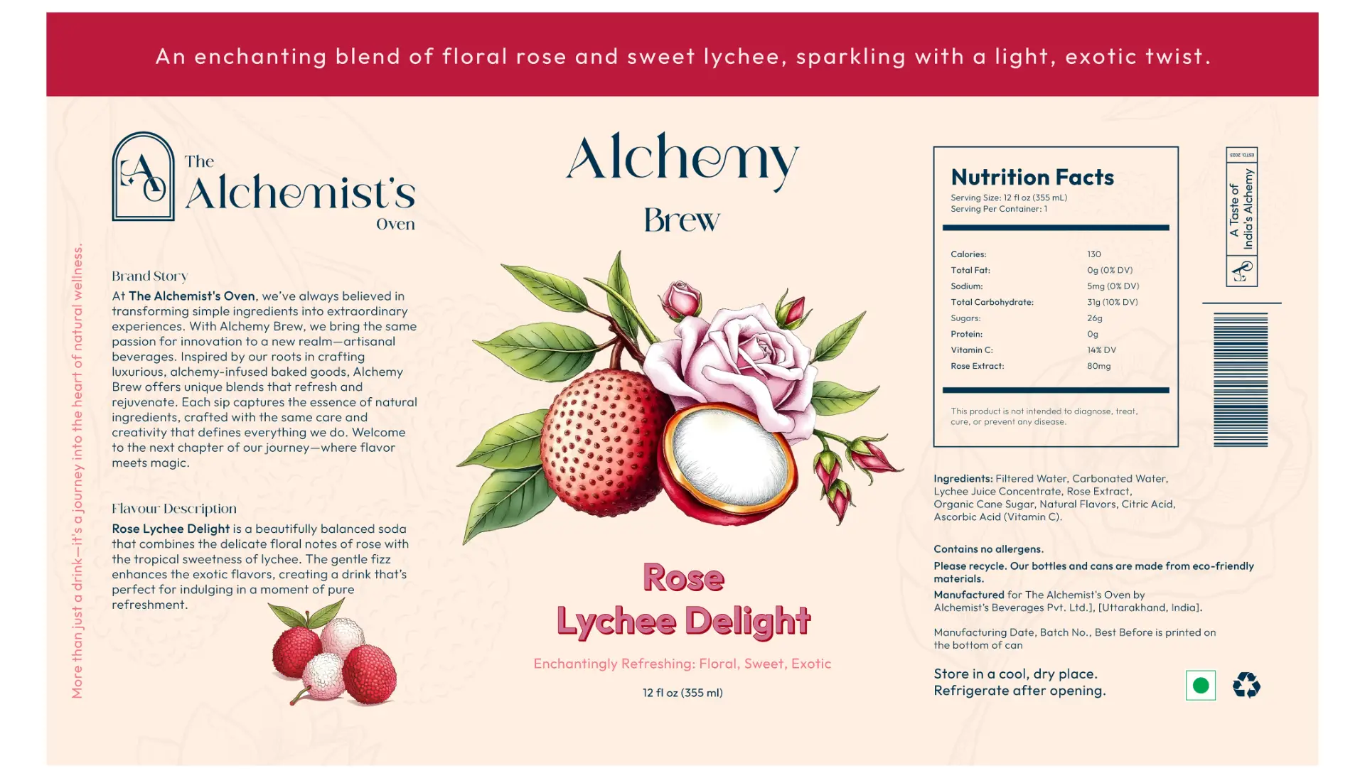
The Canvas: We rejected the standard aluminum silver or neon gloss. Instead, we wrapped the cans in a Soft Cream Matte finish. This immediately signals "Natural" and connects visually to the flour and parchment of the parent bakery brand.
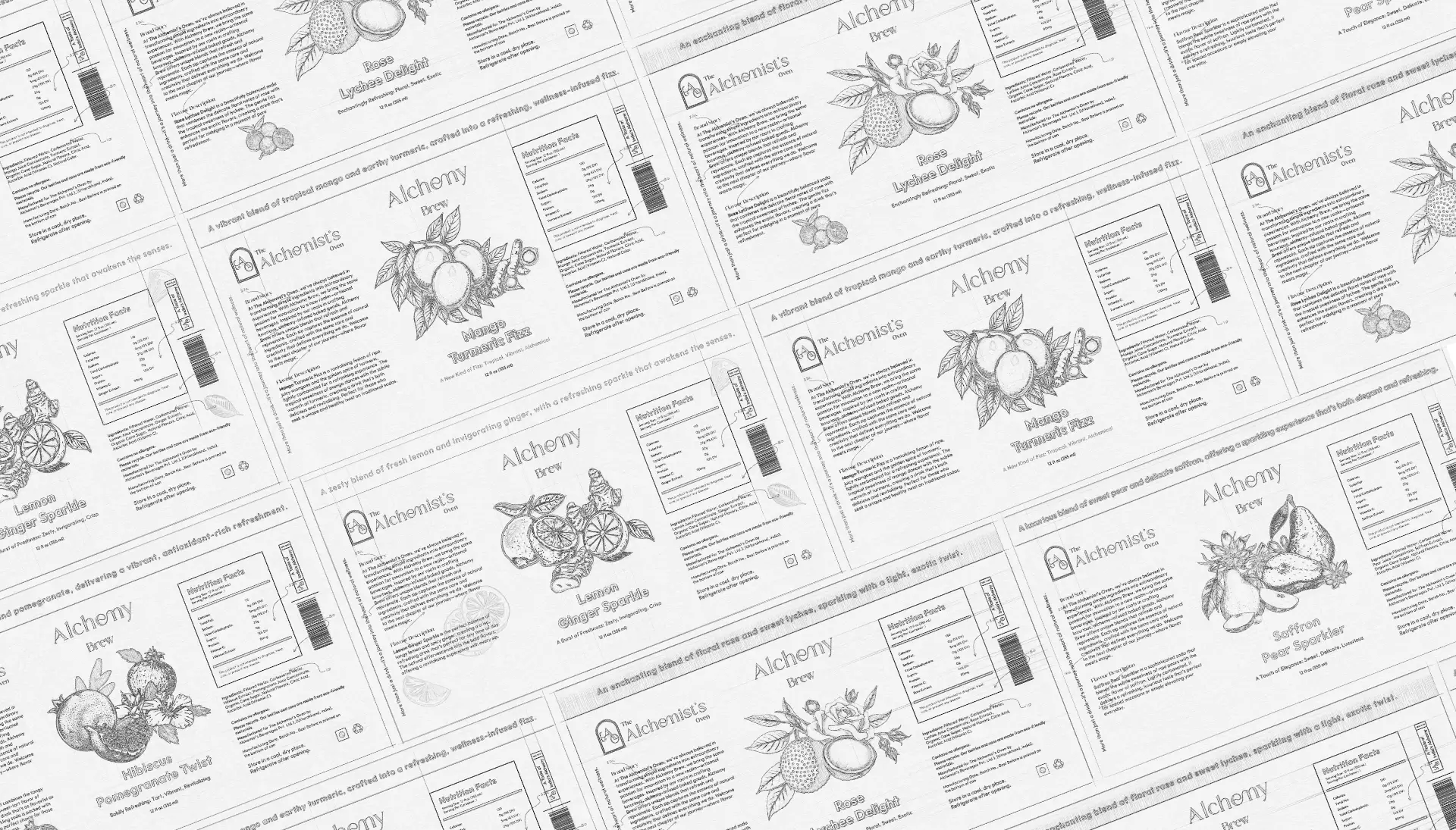
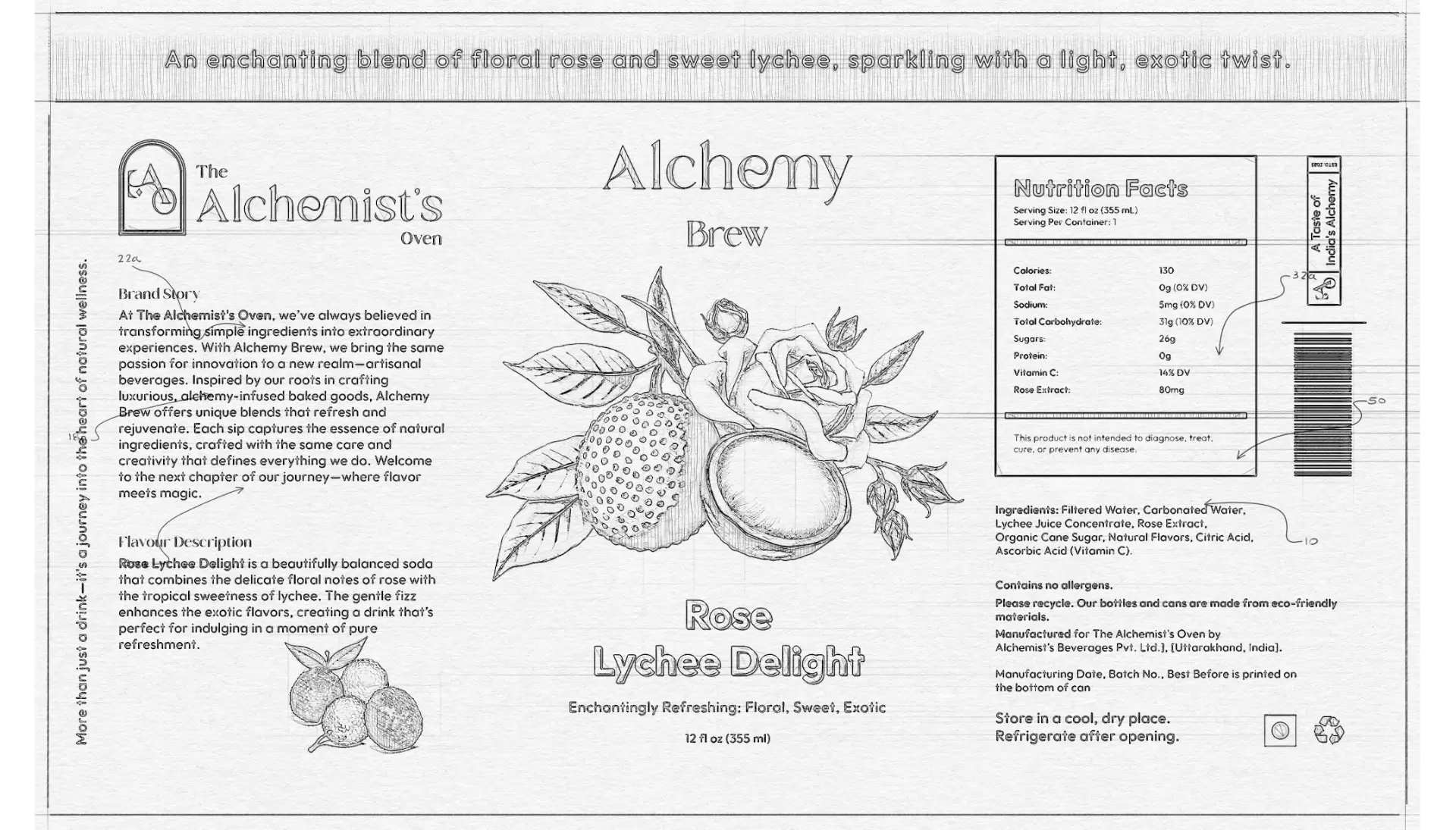
The Illustration Style: We utilized intricate, etched botanical illustrations for the hero ingredients—detailed drawings of pomegranates, pears, and ginger roots. This vintage aesthetic suggests that the drink was "crafted," not just "manufactured."
The Color Coding: While the base remained uniform, we introduced rich "Jewel Tones" for the flavor names and headers—Deep Marigold for Mango Turmeric , Ruby Red for Hibiscus Pomegranate , and Emerald Green for Saffron Pear.
The Typography: We maintained the brand's signature serif, Volgarie, to ensure the soda line felt like a legitimate sibling to the luxury pastry boxes, not a distant cousin.
The results
"A Soda That Sits at the Grown-Ups' Table."
Alchemy Brew has successfully carved out a "Luxury Refreshment" niche.
Shelf Disruption: The cream cans act as a visual "quiet zone" on the shelf, drawing the eye away from the chaotic noise of competitor brands.
Wellness Appeal: By highlighting ingredients like Turmeric and Ginger on the front of the pack, the design communicates the "Healthy Twist" instantly.
Premium Perception: The "Etched" visual language allows the brand to command a higher price point, positioning the drink as an "Elixir" rather than a mere soda. It is a brand that invites the consumer to "Taste the Magic".
Our Clients




Let’s talk with us
LET'S TALK
Home
Services
Works
About
Careers
Blog
Behance
Instargam
YouTube
Social Media
Copyright © 2026 Innosage. All rights reserved.
What's Next?
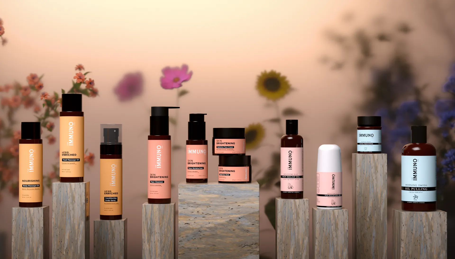
The Immuno Co.
–
How we helped an Ayurvedic wellness brand move from brief to print-ready packaging, blending ancient tradition with a modern, minimal identity that actually holds up on shelf.