
Where French Precision Meets Indian Soul.
Building a visual identity for The Alchemist’s Oven —a luxury bakery that turns heritage spices and golden crusts into a royal experience.
The Alchemist's Oven
(2025)
The luxury bakery market is often a sea of beige minimalism. The Alchemist’s Oven dared to be different. They didn't just want to bake; they wanted to blend the finesse of European pastry with the warmth of Indian alchemy. Innosage was tasked with translating this fusion into a brand identity that feels as rich as the flavors.
Client
The Alchemist's Oven
Services
Art Direction, Visual Identity, Brand Identity
The Challenge
Luxury shouldn't always look quiet.
The luxury bakery market is often dominated by a specific aesthetic: French minimalism, pastel palettes, and stark white spaces. While elegant, this visual language has become a commodity. The Alchemist’s Oven approached us with a unique proposition: they weren't just baking; they were fusing the precision of European pastry with the soul of Indian heritage. Our challenge was to visualize this 'alchemy' without falling into the trap of traditional kitsch. We needed to build a brand identity that felt expensive, aromatic, and deeply cultural—all while commanding a premium on the shelf.
Tradition in Every Crumb.
Custom Paisley motifs turn standard packaging into a luxury unboxing experience.
The Solution
To solve for 'Alchemy,' we built a visual strategy rooted in contrast and transformation. We moved away from the safety of neutrals and embraced a palette that speaks of spices and royalty. We selected Royal Blue (#0D236B) as the primary anchor—a color that exudes deep sophistication and trust—and paired it with a vibrant Saffron Yellow (#F4C430) and Metallic Gold. This interplay creates a visual vibration that mimics the warmth of an oven against the cool elegance of a luxury boutique.
For the typography, we orchestrated a dialogue between eras. We chose Volgarie, a high-contrast serif, to carry the brand’s sophisticated voice, ensuring legibility and class on primary headers. To balance this rigidity, we introduced Outfit, to give accent and playful touch, we introduced Sacramento, a fluid script that acts as the 'human hand' in the brand, reminiscent of piped icing or a signature on a masterpiece.
The logo system itself was designed as a seal of quality. The primary mark features an architectural arch—symbolizing both the traditional clay oven and the entryways of Indian palaces—intertwined with the initials 'T', 'A' and 'O'. We extended this into a pattern library featuring custom Paisley motifs and ingredients like star anise and cinnamon, ensuring that every touchpoint, from the greaseproof paper to the unboxing experience, tells a cohesive story of magical transformation.
The results
The resulting identity for The Alchemist’s Oven is a brand that commands attention before the box is even opened. By rejecting the industry standard of minimalism, we carved out a unique 'Maximalist Luxury' niche for the client. The packaging system, with its deep blues and gold foil accents, transforms a simple purchase into a gift-worthy event, allowing the brand to justify a premium price point naturally.
The visual system has proven to be highly versatile, seamlessly adapting from the intimacy of a cookie label to the grandeur of storefront signage. We successfully turned the abstract concept of 'Indian Alchemy' into a tangible, desirable asset. The brand no longer just competes on taste; it competes on feeling. It stands as a testament that heritage and modern luxury can coexist, creating a sensory experience that resonates with customers looking for substance, story, and soul in their daily indulgences.
Our Clients




Let’s talk with us
LET'S TALK
Home
Services
Works
About
Careers
Blog
Behance
Instargam
Social Media
Copyright © 2026 Innosage. All rights reserved.
What's Next?
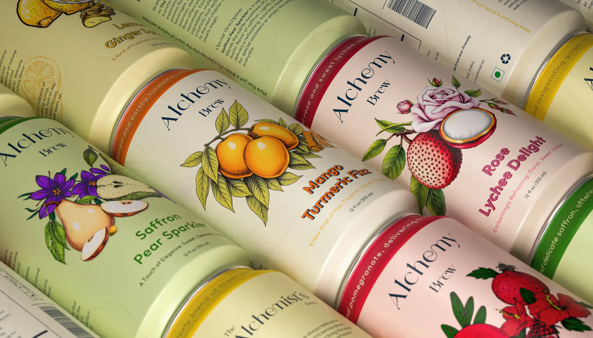
Alchemy Brew
–
Extending the luxury heritage of The Alchemist’s Oven into a sparkling soda line where wellness meets indulgence, and simple ingredients transform into extraordinary elixirs.