
Where Ancient Wisdom Meets Modern Shelves.
Redefining Ayurvedic beauty for the modern shelf. We built a minimalist, illustration-driven packaging system and digital visual identity.
The Immuno Co.
(2025)
The Immuno Co. approached us for the launch of their new line of Ayurvedic face and hair care products. Their mandate was clear: they wanted to stand out. The brand needed a minimalist aesthetic that felt calming and luxurious, completely stepping away from the traditional, heavily ornamented look of typical Ayurvedic brands. What began as a streamlined exploration of simple, moodboard-driven packaging quickly evolved into a full-scale visual identity project, expanding our scope from flat label design to bespoke illustrations, high-fidelity 3D mockups, and complete e-commerce art direction.
Client
The Immuno Co.
Services
Packaging Design, Custom Illustration, 3D Modeling,
E-Commerce Art Direction
The Challenge
An Ayurvedic brand that didn't want to look Ayurvedic.
The Ayurvedic beauty market is full of brands that look exactly the same — earthy greens, busy botanical prints, and labels packed with Sanskrit. The Immuno Co. wanted none of that. They were building something new: Ayurveda that feels modern, premium, and genuinely approachable to a younger buyer.
The ask was clear: minimalist, pastel, and different. A product range that needed to work across two distinct lines — Herb Enriched hair care and Skin Brightening skincare — while still looking like it all belongs to the same family. Clean. Confident. Nothing gaudy.
The brief was tight. But somewhere along the way, the project became a lot bigger than just packaging.
"Minimalist, not gaudy. Different, but not trying too hard. That's a short brief with a big ask behind it."
Our Process
Five phases. One shared direction throughout.
01 Discovery
Brief deep-dive, competitor audit, audience mapping
02 Moodboard
Color direction, texture references, packaging inspiration
03 Illustration
Sketches → AI exploration → final Illustrator artwork
04 Color Proofing
Physical prints reviewed together until the color was right
05 Delivery
Print-ready files, 3D visuals, Amazon A+ content
Every reference had a reason.
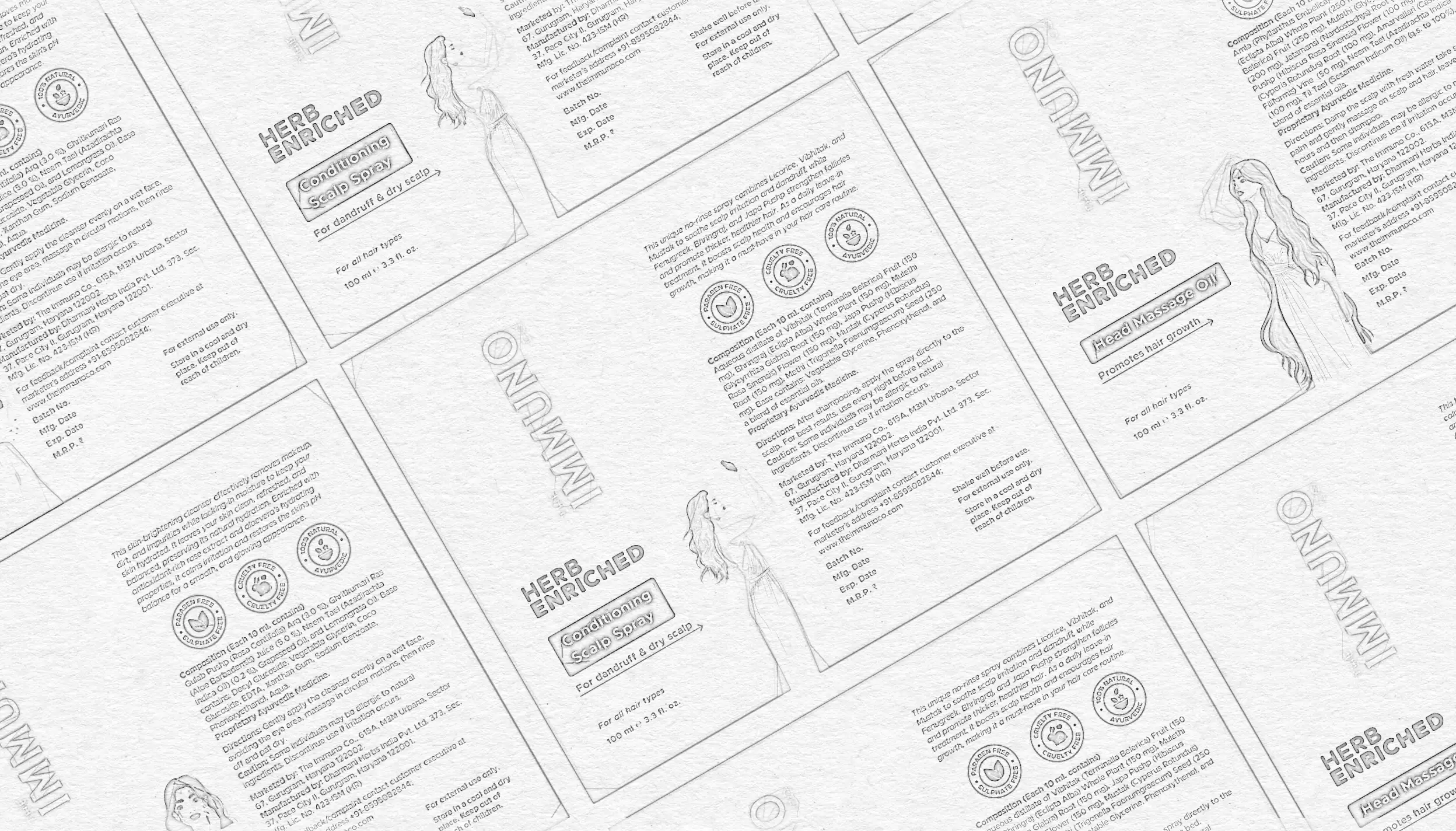
The moodboard wasn't decoration — it was a brief in visual form. Each image, texture, and color choice was pointing toward a specific feeling. Here's the thinking behind it, ready to sit over your process images.
The Solution
Built together, one decision at a time.
We started with a moodboard not just a mood wall, but a real creative direction in visual form. Soft pastels, spa-like references, minimal layouts. The founder was in the room with us from the beginning: reacting, redirecting, making real decisions at every stage.
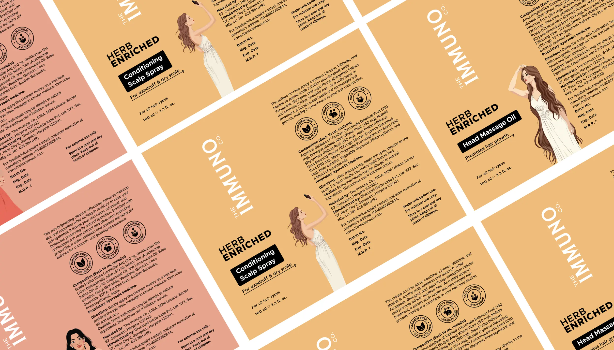
Then the print proofs arrived. The soft palette beautiful on screen fell completely flat on paper. So we shifted. Warmer, earthier tones. Amber gold for the hair care line. Terracotta and dusty rose for skincare. The colors got richer and suddenly the packaging felt as warm and credible as the ingredients inside it.
Illustrations weren't in the original brief. But as the layouts took shape, we both felt the packaging needed a human presence not a pattern, not a diagram, just a woman in her ritual. We pitched it. The client said yes. We sketched rough concepts, explored variations with AI tools, and drew the final characters by hand in Illustrator. Each figure specific to her product her gesture, her world.
From there, we built 3D product visuals in Blender for listings and presentations, and created the complete Amazon A+ content suite. Everything the brand needed to show up properly in hand and on screen.
01
Pastels looked great on screen. Print told a different story.
Multiple physical proofs pulled by us and the client together until the color felt as rich in hand as it did on a monitor.
02
Two lines, two palettes, one brand that holds together.
Amber gold for hair care. Terracotta rose for skincare. Different enough to tell apart, similar enough to belong together.
03
Illustrations were never in the brief until we made the case.
Rough sketches, AI explorations, final artwork drawn by hand in Illustrator. Each character drawn for her specific product.
04
The wordmark is the design. Everything else is supporting cast.
A tall vertical "THE IMMUNO CO." anchors every face of every pack. Architecture before decoration.
The results
Packaging that people actually noticed.
The Immuno Co. launched on Amazon with a full product range — seven SKUs, two product lines, every file print-ready and delivered on time. But what happened after launch is what makes this one worth talking about.
The packaging became the most commented-on thing about the brand. Customers on Amazon started calling out the design in their reviews — the look, the feel, how different it seemed from everything else in the Ayurvedic category. For a new brand in a crowded space, that kind of organic recognition is exactly what you want in the early days.
Sales picked up. Repeat orders followed. And the brand that launched with a brief about being "different" was starting to genuinely stand out — not just on a slide deck, but on a screen where real people were buying.
01
Customers noticed the packaging in reviews
Organic mentions of the design on Amazon from real buyers, without being prompted.
02
Sales grew after launch
Repeat orders started coming in as the brand found its footing on the platform.
03
Stood out in a crowded category
In a sea of similar Ayurvedic brands, the visual identity gave The Immuno Co. a clear identity of its own.
Testimonials
"Working with Shashwat has been an incredibly rewarding experience. I shared my thoughts and ideas with him, and he brought them to life beautifully from packaging to creatives, everything has exceeded my expectations. What stood out the most was his patience and collaborative spirit. He doesn't just deliver work, he becomes part of the journey."
Shiwali Rathi
Founder of The Immuno Co.
Our Clients




Let’s talk with us
LET'S TALK
Home
Services
Works
About
Careers
Blog
Behance
Instargam
Social Media
Copyright © 2026 Innosage. All rights reserved.
What's Next?
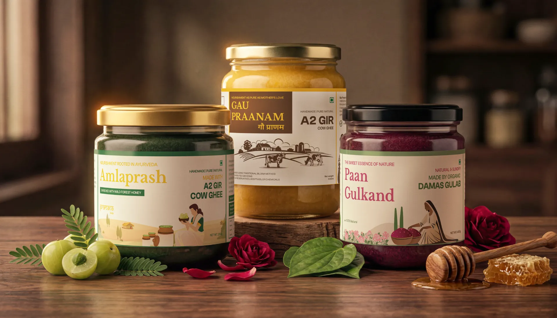
Pramana Veda
–
A premium packaging series for traditional Indian wellness supplements. We tackled the complex challenge of high-density information architecture, blending mandatory compliance data with bespoke, heritage-inspired illustrations to create labels that breathe purity and trust.